Built for customers: Core Rules of a Conversion-First Website Layout
There is a massive difference between a website that looks like a pretty digital art piece and a website that acts as a 24/7 client-acquisition engine.
Too many businesses invest heavily in beautiful graphics and sleek animations, only to wonder why their bounce rates are high and their contact forms remain completely empty.
If your website isn't actively converting visitors into warm leads or paying customers, your layout is failing you. To fix this, you must shift your focus toward conversion-first web design. Here are the non-negotiable structural rules for turning your website traffic into real revenue.

1. The 5-Second Rule: Clarify Your Hero Section
When a visitor lands on your website, they should understand exactly what you do within five seconds of the page loading—before they ever scroll down. This top portion of your site is known as the Hero Section. To maximize conversion, it must instantly answer three questions:
What specific problem do you solve?
Who exactly do you solve it for?
What step does the user need to take next?
2. The Power of One Primary Call-to-Action (CTA)
When users are given too many choices, they freeze up and take no action at all. This psychological phenomenon is called choice paralysis.
Your layout should feature one primary goal per page. If your main goal is to get users to book a consultation call, that primary CTA button should be high-contrast, placed in the top right corner of your navigation bar, and repeated clearly down the page.
Secondary actions (like reading a blog or downloading a free guide) should use subtle outline buttons so they do not compete with your primary goal.
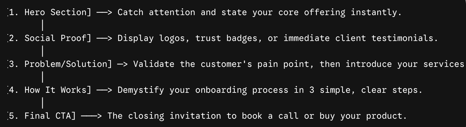
3. The Ideal Homepage Blueprint (The Conversion Pyramid)
To guide a cold visitor toward becoming a buyer, structure your homepage layout down a logical, psychological path:
4. Strict Mobile-Responsive Optimization
An alarming number of sites are designed solely on a desktop monitor, completely ignoring how they render on mobile devices. Over 55% of global website traffic comes from mobile phones.
A conversion-first layout prioritizes the mobile experience. This means text sizes scale down elegantly, buttons are large enough to easily tap with a thumb, images compress to load instantly over cellular data, and forms are simple to fill out on a small screen.
5. Clear the Technical Friction
Every extra second your website takes to load decreases your conversion rate by an average of 7%. A high-converting layout uses optimized, compressed imagery, avoids overly heavy video loops that bog down loading speeds, and utilizes clear, accessible heading tags (H1, H2, H3) so search engines can easily index and rank your content.
Conclusion
A great website isn't a digital brochure; it is your hardest-working sales representative. By applying intentional user-experience rules, you turn your digital home into a conversion powerhouse.
Ready to transform your Squarespace, Wix, or Shopify site into a client-generating asset? Let’s build your high-converting website today.